
95% of South Florida Law Firm Websites Have the Errors Behind ADA Lawsuits
We scanned 105 South Florida law firm websites for the accessibility errors cited in ADA website lawsuits. 98 of the 103 we could scan had at least one.

We scanned the home pages of 105 South Florida law firms for the accessibility errors that ADA website lawsuits are built on. 98 of the 103 we could scan, 95%, had at least one. Only 5 didn’t.
The typical home page had 15 accessibility errors. The most common were text too faint to read, contact forms a screen reader can’t fill in, and links and buttons with no name.
What this means for a law firm
The Americans with Disabilities Act is federal law, and its Title III covers businesses open to the public. Law offices are named in it: the statute’s list of public accommodations includes the “office of an accountant or lawyer.” The Justice Department’s position is that the websites of businesses open to the public have to be accessible too, and it points to the Web Content Accessibility Guidelines (WCAG) as the yardstick.
No federal regulation sets the exact technical standard for a private firm’s website, and the courts haven’t settled every question. That hasn’t slowed the lawsuits:
- 3,117 website accessibility lawsuits were filed in federal court in 2025, up 27% from 2024, according to Seyfarth Shaw’s count.
- Florida is one of the busiest states for them. In January 2026 it led the country with 88 filings.
- The money is in the fees. A plaintiff under Title III can get a court order to fix the site, and the court can make the business pay the plaintiff’s attorney’s fees. That’s why most of these claims start as a demand letter and end in a settlement, not a trial.
Lawsuits aren’t the only cost. More than 1 in 4 U.S. adults has a disability. A site a screen reader can’t get through loses those clients the way a slow site loses everyone else: they call the next firm. More than half the sites in this study have a contact form that a blind visitor can’t fill in.
I’m not naming firms. This is the normal state of law firm websites in the market I work in, and I’d bet most firm owners have never run the check. This is research, not legal advice: if you’ve received a demand letter, talk to a lawyer who defends ADA claims.
The results at a glance
- 95% of sites (98 of 103) have at least one of four errors frequently cited in ADA website lawsuits: low-contrast text, unlabeled form fields, links or buttons with no name, and images with no description. Only 2 came back with no errors at all.
- 83% have text too faint to read against its background, even after throwing out the readings that turned out to be scanner mistakes.
- 54% have form fields with no label, usually on the contact form.
- 47% have links or buttons with no name, which a screen reader announces as just “link” or “button.”
- 37% have real images with no description: attorney photos, logos, award badges. Another 48% have it only on small decorative icons, a quicker fix.
- The typical home page has 15 errors. 31 sites have 25 or more.
- 90 of the 103 sites fail both this check and Google’s speed test. Only 2 pass both.
- No county does better. All 32 Palm Beach sites in the sample failed, as did 37 of 39 in Broward and 29 of 32 in Miami-Dade.
How the test worked
- The sites. A random sample of 105 of the 421 working websites from our South Florida law firm speed study, drawn in proportion to each county: 40 in Broward, 33 in Miami-Dade and 32 in Palm Beach. Home page only.
- The scanner. WebAIM’s WAVE, the same engine behind the WebAIM Million, the yearly accessibility check of the web’s top million home pages. Each page was loaded in full at desktop width, given a moment for its animations to finish, and checked against WCAG on October 27, 2026.
- Two sites couldn’t be scanned. One asked for a password and one showed a bot check instead of the site, which leaves 103.
What counts as failing. A site fails if WAVE finds at least one of four basic errors that make a site unusable with a screen reader or hard to read with low vision. All four are on the Bureau of Internet Accessibility’s list of barriers frequently cited in ADA lawsuits. The fifth on that list, keyboard traps, takes a person to test. They’re also the most common errors on the web: with empty buttons and missing page language, they make up 96% of all the errors in the WebAIM Million.
What I didn’t count.
- WAVE often misreads contrast on pages with animations or layered backgrounds. A low-contrast reading only counted if it held up: readings of invisible text, or of text the same color as its background, were thrown out.
- Icons drawn in code (SVG) with no description are reported separately, because they’re usually decorative and the fix is one attribute.
- WAVE’s “alerts,” which need a person to judge, aren’t counted.
The limits. An automated scan finds only some accessibility problems. WebAIM says so itself: no errors detected doesn’t mean a page is accessible. A site that passed here can still fail a manual review.
What fails most
The accessibility errors on South Florida law firm home pages
Share of the 103 sites with at least one instance
- Text too faint to read (low contrast) 82.5%
85 sites · typically 11 instances each
- Form fields with no label 54.4%
56 sites · typically 4 fields each
- Links with no name 41.7%
43 sites
- Real images with no description 36.9%
38 sites · 49 more only on decorative icons
- Buttons with no name 10.7%
11 sites
- Empty headings 5.8%
6 sites
- No page language set 2.9%
3 sites
The four errors, in plain English
Text too faint to read: 83% of sites
Light grey text on white, white text over a photo, a pale gold button. WCAG asks for a contrast ratio of at least 4.5 to 1 for normal text, and 3 to 1 for large text. People with low vision can’t read text that falls short, and neither can anyone reading a phone in the Florida sun. The typical failing site had 11 pieces of text that fell short.
The fix: darken the text or the background until it passes. It’s usually a handful of color values in the site’s theme.
Contact forms a screen reader can’t fill in: 54% of sites
A label is the text tied to a form field in the page’s code, so a screen reader can say “Name,” “Phone” or “Tell us what happened.” Without one, it can only announce an empty box, and the visitor has to guess what goes in it. The typical site with the problem had 4 unlabeled fields.
On a law firm site, that’s usually the intake form: the one page that’s supposed to turn a visitor into a case.
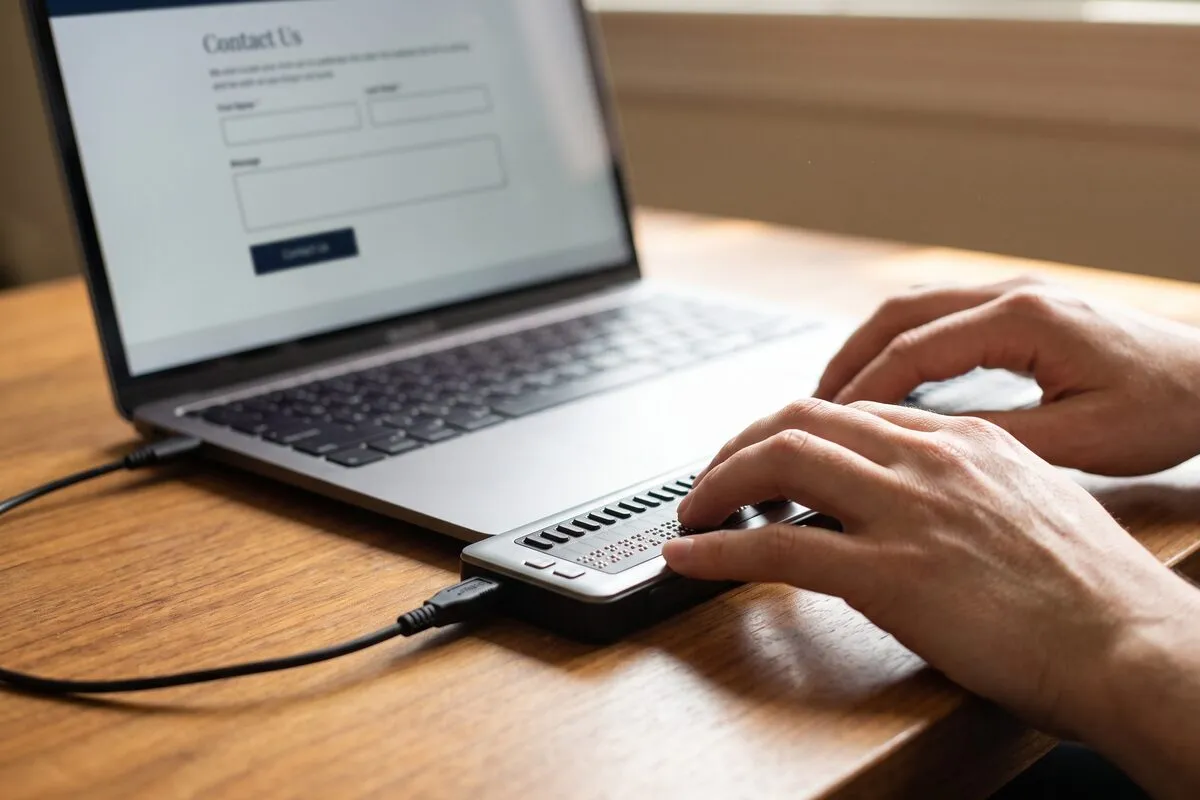
The fix: give every field a visible label that’s tied to it in the code. Most form plugins have a setting for it.
Links and buttons with no name: 47% of sites
These are mostly icons: the Facebook and Instagram links in the footer, the phone icon, the slider arrows, the menu button. On screen they’re obvious. A screen reader announces “link” or “button” and nothing else.
The fix: give each one a name in the code, such as “Call our office” or “Next slide.”
Images with no description: 37% of sites
Attorney headshots, the firm’s logo, award badges. A text description, called alt text, is what a screen reader reads in place of the picture. 38 sites have real images without one.
WAVE flags far more than that: 87 sites, or 84%. The extra flags are small icons drawn in code, like arrows and checkmarks, that the site never marked as decorative. By WAVE’s rules that’s still an error, but it’s a quick one to fix: one attribute (aria-hidden) on each icon.
The fix: describe the images that carry meaning, such as “Founding attorney [name] in the firm’s Fort Lauderdale office,” and mark the decorative ones so screen readers skip them.
How many errors a typical site has
Accessibility errors per home page
Errors WAVE found on each site, not counting decorative icons with no description
- None 4 sites · 3.9%
- 1 to 9 26 sites · 25.2%
- 10 to 24 42 sites · 40.8%
- 25 to 49 26 sites · 25.2%
- 50 or more 5 sites · 4.9%
Those counts aren’t dozens of separate mistakes. On 86 of the 103 sites they come mostly from just one to three of the four errors, repeated across the site’s template: every footer icon, every field of the form, every faint line of text. That’s good news, because fixing the template fixes them all at once.
Law firm sites are no better than the rest of the web
WebAIM’s own scan of the web’s top million home pages, from February 2026, makes a useful comparison.
| Error | South Florida law firms (103 sites) | Top million home pages |
|---|---|---|
| At least one error found | 98.1% | 95.9% |
| Low-contrast text | 82.5% | 83.9% |
| Form fields with no label | 54.4% | 51.0% |
| Links with no name | 41.7% | 46.3% |
| Buttons with no name | 10.7% | 30.6% |
| No page language set | 2.9% | 13.5% |
Low contrast is likely the stricter count here, since this study threw out readings that looked like scanner mistakes. Missing image descriptions are left out because this study counted real images and icons separately, so the two numbers don’t line up. Source: WebAIM Million, 2026.
Law firm websites are about as inaccessible as the rest of the web. The difference is that a law office is a public accommodation by name, in a state where these suits are filed every week, and a law firm knows better than most businesses what a demand letter costs to answer.
Slow and inaccessible usually go together
The same 103 sites were in our speed study, so it’s possible to see both results side by side.
Speed and accessibility, together
The same 103 sites: Google's mobile speed test, and this accessibility check
- Fail both
- Fail accessibility only
- Fail speed only
- Pass both
- 103 law firm sites 2 pass both
Fail both 87.4% · Fail accessibility only 7.8% · Fail speed only 2.9% · Pass both 1.9%
In my experience the cause is often the same: a theme or page builder that piles on sliders, icon fonts and widgets, and nobody checks what the page actually delivers. When I rebuild a firm’s site, both get fixed in the same pass.
By county and practice area
Every Palm Beach site in the sample had at least one of the four errors (32 of 32), against 37 of 39 in Broward and 29 of 32 in Miami-Dade. The counties are closer than that makes them sound: the typical site had 14 to 18 errors in all three.
Practice area made more of a difference. Personal injury and criminal defense sites had the most errors, a typical 21 and 19 per home page, against 15 across the study. All 17 criminal defense sites failed, and 16 of 17 personal injury sites. The practice groups are small in a 105-site sample, so read this as a direction, not a ranking.
Skip the one-line widget
Accessibility overlay widgets promise to make a site compliant by adding one script. In April 2025 the Federal Trade Commission ordered accessiBe, one of the best-known overlay vendors, to pay $1 million over claims that its widget made websites WCAG-compliant. The errors in this study live in the site’s own code, and that’s where they get fixed.
Check your own site in 10 minutes
- Open WAVE, paste your home page’s address and run it. It’s free, and it’s the same scanner as this study.
- Look at Errors and Contrast Errors in the summary. Click any icon on the page to see the exact element.
- Start with your contact form. Every field needs a label.
- Put the mouse away and press Tab through the page. You should always be able to see where you are, and reach every link, button and form field.
- Turn on your phone’s screen reader (VoiceOver on iPhone, TalkBack on Android) and try to send yourself a message through your own contact form.
Then fix the four errors in the site’s code, and have someone review the site by hand. An automated scan is the floor, not the finish line.
If your scan shows errors on the contact form, or more than a dozen contrast errors, that’s a template problem, and it’s faster to fix at the source than page by page. I fix these as part of a website rebuild or on their own. Write me at hi@carlosarias.com.

I'm a Marketing Engineer specializing in digital marketing for law firms, helping firms turn online visibility into signed cases. I work directly with a select group of firms on SEO and local search, website conversion, lead intake and follow-up, CRM automation and marketing analytics.
Continue reading

Your Law Firm Can Get Sued Over Its Own Website (The Widget Won't Save You)
Your law firm can get sued over its own website. The ADA names lawyers' offices by statute, the overlay widget is not a defense, and the fix pays twice.
Up to 90% of South Florida Law Firms Failed Google's Speed Test
We ran Google's speed test on 421 South Florida law firm websites. 379 failed on a phone. Here's what a slow site costs a firm in rankings and signed cases.
Florida Law Firm Wiretapping Liability: $100 a Day Plus Their Fees
Florida's 1969 wiretap law demands all-party consent before a pixel reads your intake form. Lose, and § 934.10 hands the plaintiff your fee invoice too.